

I like to draw and I have been focusing on portraits, but many people ask me where I get my ideas from. When deciding on what type of portrait to draw, I like to take inspiration from my day. Every day has a different opportunity and today I just happened to see a photo of myself back in elementary school. I thought this would be a fun drawing for the day.
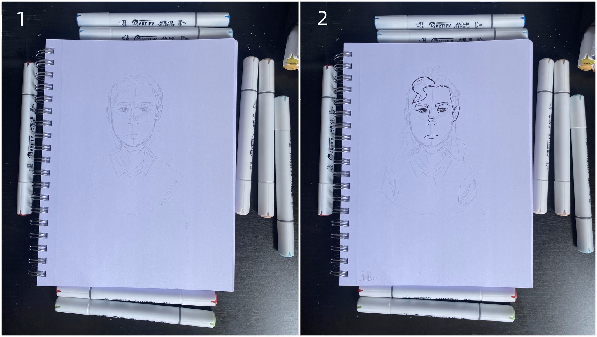
Step1.
Some people just start drawing with their markers but I like to start off by lightly sketching out the drawing on a piece of paper instead of going straight into using markers. The type of paper you use is also very important. I prefer to use multi-media paper for markers because for the most part the ink does not bleed through the paper and it allows me to blend my colors more easily.
Step2.
Once I’m satisfied with some of the lines I’ve sketched out, I like to use a thin marker to outline those lines. I personally like to start with the head and work from there. Now I am committed to these lines, this is going to be my final portrait so it can be a little bit stressful, especially if you are drawing a real person. If this was a fictional character it wouldn’t matter so much, but this is me!
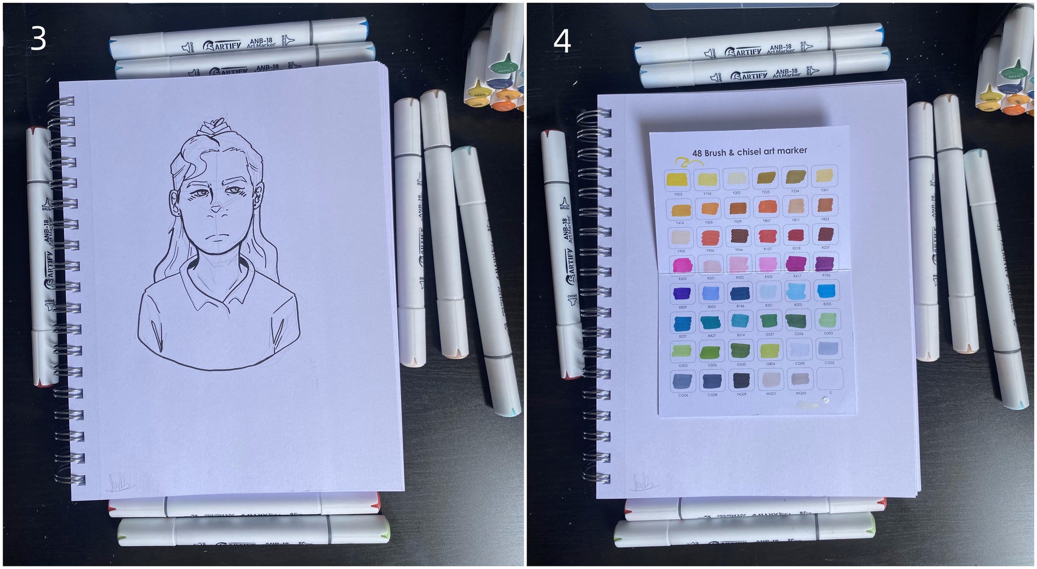
Step3.
After I’ve outlined all the lines I want to include in my drawing, I like to erase any extra pencil marks from when I was sketching. This cleans up the final portrait and gives us a nice almost-finished product.
Step4.
For this portrait drawing I will be using my Artify 48 brush and chisel art markers. I have really been enjoying my Artify markers! The quality is really good for the price, each marker has two brush sizes, colors are easy to blend, and the marker sets come with a chart for color swatches (very useful). Having a color swatch is just as important as having the right art supplies. The color swatch sheet helps you save time and ink in this case. I know exactly what color each marker is going to leave on the paper.
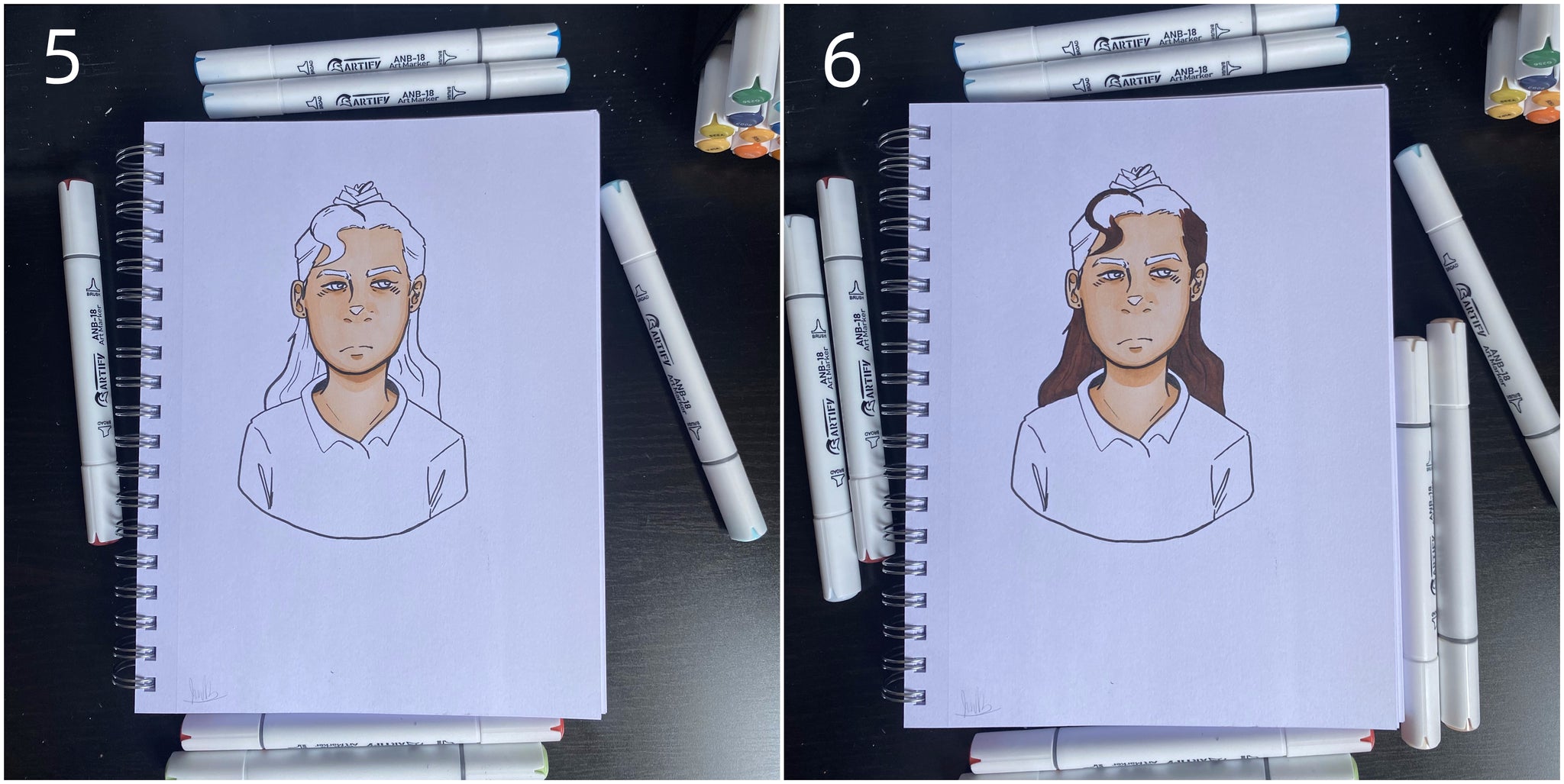
Step5.
I like to start with light colors and work my way up to darker colors. This makes the most sense to me because the darker colors will blend very nicely on top of the lighter colors. Even with the same color, if we add layers, it will give a different shade of that color. In this case, I decided to start with a light skin tone base and then use a slightly darker shade to add more contrast. As mentioned before, these markers do a good job of blending colors. By blending colors and adding layers, you can create more depth.
Step6.
As I move on to the hair, I am following the same technique I used for the skin; I start off with a light color and then work my way towards a darker color. This color is quite dark so once the hair is colored in, I go back with a black marker to draw some strands of hair to create more depth.
Step7.
Time to focus on my clothes. Since I’m working with a white shirt, I used a light blue color for shading. Usually shading in clothes consists of creating folds and wrinkles. A few subtle lines in the right areas really makes my shirt look more natural.
Step8.
I’m pretty happy with the portrait itself but something is missing. It looks a little flat on the paper; there is too much white space. So, I’m going to create a background. Instead of leaving the background white, I’ve decided to use an orange color to make my drawing pop more. It is a complimentary color to the hair and skin colors in this portrait, and I feel like it gives a nice calming finish to the project.

Not all portraits have to be extremely detailed. I’m happy with how this portrait drawing came out. Thanks to Artify I can continue to do what I love. I hope you enjoyed it!..